Overview
This project was initiated to design an innovative journaling system for a pre-seed startup, aiming to cater to high-functioning individuals with limited time for self-reflection. The decision to develop this system was informed by the identified need for a quick, engaging, and effective journaling method that could be easily integrated into busy lifestyles.
As the UX/UI designer on the team, I was tasked with creating both a physical journal for use at retreats and conceptualising a mass-market digital application. My responsibilities included designing the core journaling system, developing a comprehensive interaction design, and creating high-fidelity mock-ups of physical and digital products. This work was carried out in collaboration with the company’s leadership team and formed a crucial part of our investor pitch deck.
Defining The Problem
The primary challenge was to create a journaling system that would overcome the common barriers to consistent self-reflection practices, particularly for time-constrained, high-achieving individuals.
Key issues we needed to address included:
- Time Constraints: Traditional journaling is often perceived as time-consuming, making it challenging for busy professionals to incorporate into their daily routines.
- Engagement: Many people find it difficult to maintain a consistent journaling habit, often due to a lack of immediate perceived benefits or feedback.
- Skill Development: There was a need to subtly teach self-reflection skills without overwhelming users, especially considering the introduction of a new system.
- Brand Alignment: As a luxury brand catering to high-profile clients, the product needed to offer a unique, premium experience that set it apart from conventional journaling methods.
- Resource Limitations: Operating in a pre-seed startup environment meant working with limited resources and under significant time pressure, as the product needed to be ready for testing at an upcoming pilot retreat.
- Dual Format: The solution needed to work effectively as both a physical product for immediate use and a conceptual digital application for future scalability.
The key was to design a system that would address these challenges while providing immediate value to users and aligning with the company’s luxury brand positioning. This required a delicate balance of simplicity, effectiveness, and premium design, all achievable within the constraints of a startup environment.
Users
The target audience for this journaling system was carefully defined to align with the luxury brand positioning and the specific needs of high-achieving individuals.
The ideal customer persona included:
- Demographics: Executive-type professionals, aged 35-60, with the majority identifying as female, though the product remained approachable to male users.
- Economic Status: Wealthy individuals with disposable income for premium wellness products.
- Interests: Wellness, flow state, high-performance, mindfulness, and self-improvement.
- Lifestyle: Extremely busy schedules with limited free time for personal development activities.
- Professional Status: CEOs, executives, and other high-level decision-makers.
Key characteristics of these users include:
- Time scarcity: They value efficiency and quick results.
- Achievement-oriented: They are driven by goals and measurable outcomes.
- Quality-conscious: They expect premium experiences and products.
- Tech-savvy: Comfortable with digital solutions but appreciative of tactile, offline experiences.
Understanding these user characteristics was crucial in designing a journaling system that would not only meet their practical needs but also align with their values and lifestyle preferences. The challenge was to create a product that felt both exclusive and accessible, catering to their desire for self-improvement while respecting their time constraints and high standards.
Process & Iterations
1. User Flow Mapping
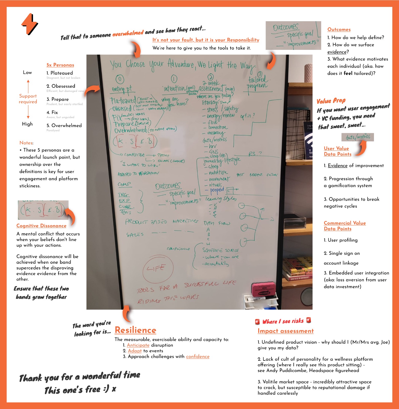
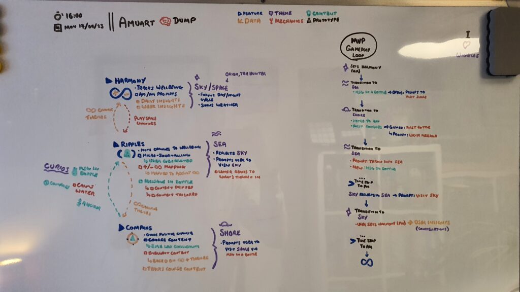
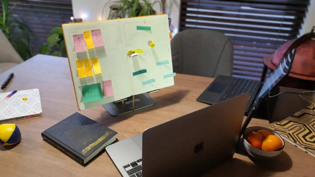
We began by mapping out the user flow on a whiteboard. This crucial step allowed us to visualise the entire user journey, identifying key touchpoints and potential pain points. The whiteboard session helped us to:
- Define the core journaling experience
- Identify opportunities for gamification
- Ensure a seamless flow between different elements of the system
This approach helped identify key themes and features that would keep users engaged, focusing on interaction design and mapping out system interactions, user journeys, and gameplay loops.
2. Low-fidelity Mockups and Initial Pitch
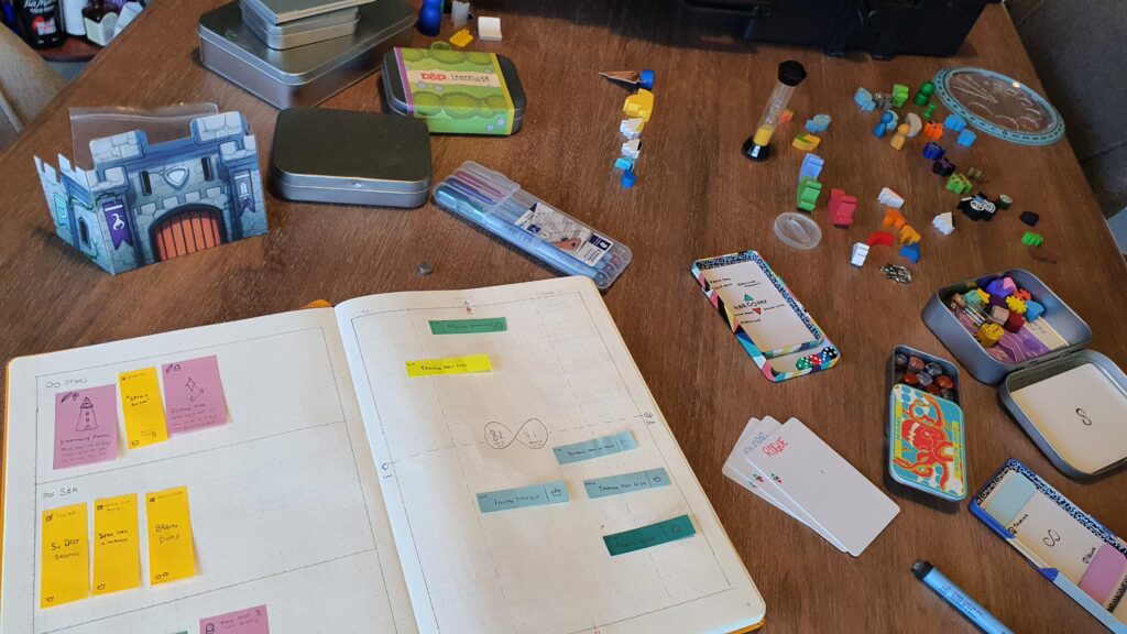
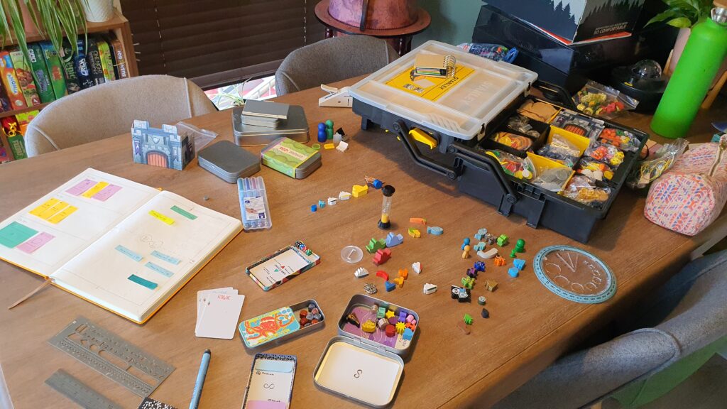
Next, we created hand-drawn, low-fidelity mockups of the physical journal. These sketches helped us quickly iterate on different layouts and features. A unique aspect of this stage involved using a physical game design kit to create a ‘white box’ environment. This hands-on method allowed for quick testing and iteration of the product’s look and feel, providing a tangible representation of our ideas.
Due to tight timelines, we presented these initial concepts to the CEO via a video call. This early pitch was crucial in gaining approval for further development and ensuring alignment with the company’s vision.
3. High-fidelity Journal Mockups
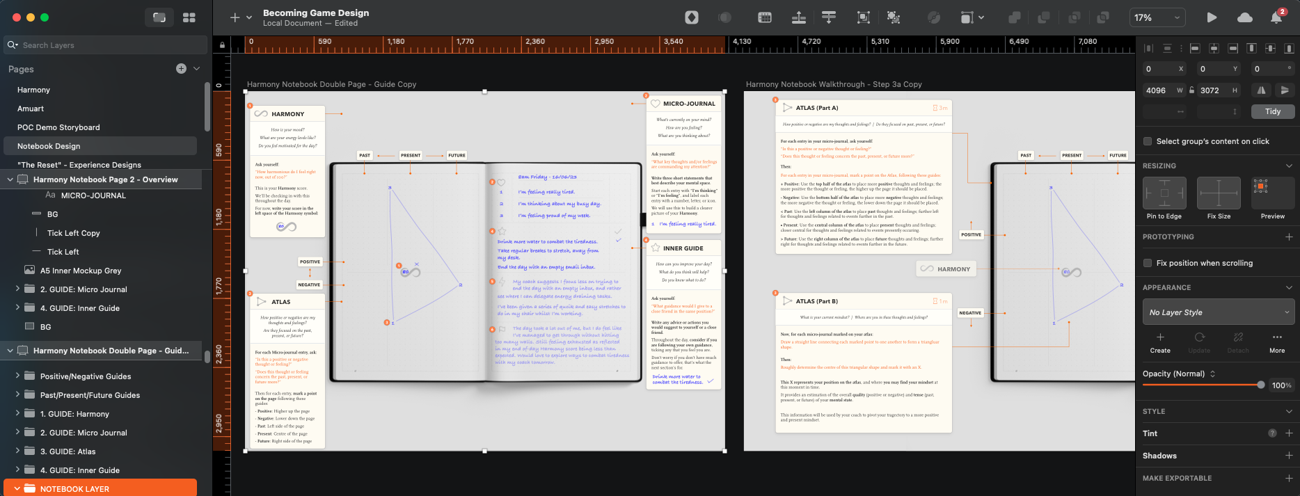
Based on the approved low-fidelity concepts, we developed high-fidelity mockups of the journal using Sketch. These detailed designs included:
- Cover designs
- Page layouts
- Custom prompts and exercises
- Visual elements to enhance user engagement
4. Digital Application Concept
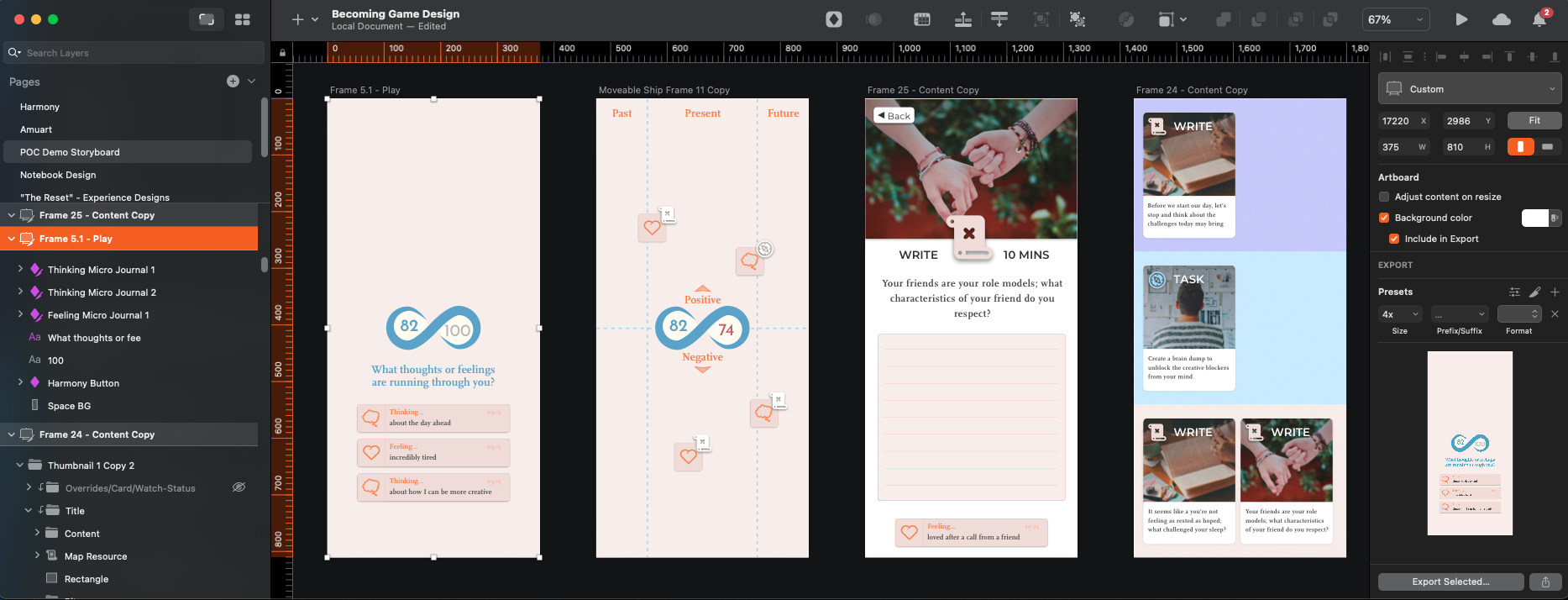
Parallel to the physical journal development, we created low-fidelity mockups for a potential digital application. These Sketch-based designs explored how the journaling system could be translated into a digital format, considering:
- User interface elements
- Navigation structure
- Feature parity with the physical journal
- Unique digital capabilities
- Gameplay
This led to the creation of a high-fidelity showcase of the digital application, which was used both for internal demonstrations and as part of the investor pitch deck.
Final Design Solution
My design process produced two connected products: a physical journal and a conceptual digital application. Both were designed to provide a unique, efficient, and engaging journaling experience for our target users.
1. Physical Harmony Journal
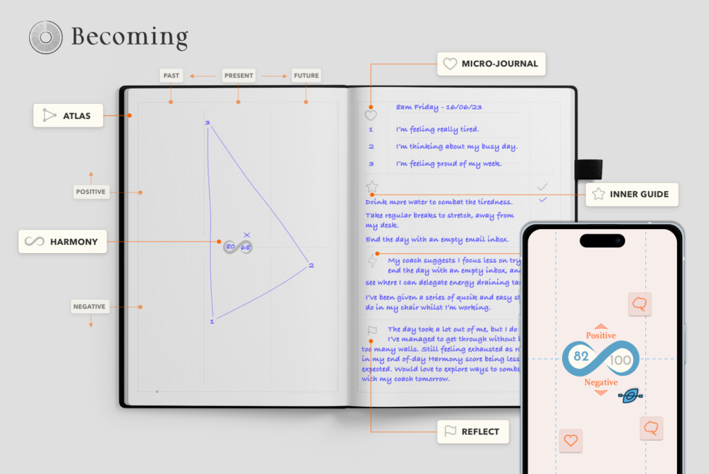
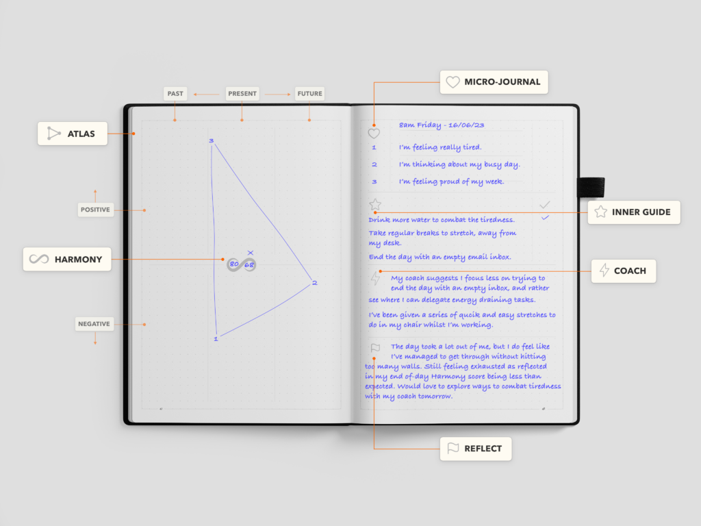
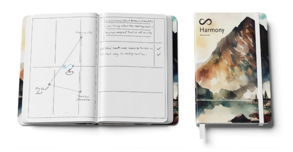
The physical journal represents the immediate, tangible outcome of our design process. We created a high-fidelity prototype that closely resembled the final product, complete with:
- Custom cover design
- Carefully crafted page layouts
- Tailored prompts and exercises
- Visual elements to enhance user engagement
To showcase the journal’s functionality and design, I produced a walkthrough video. This video demonstrated the journal’s key features, user flow, and how it addresses the needs of our target audience.
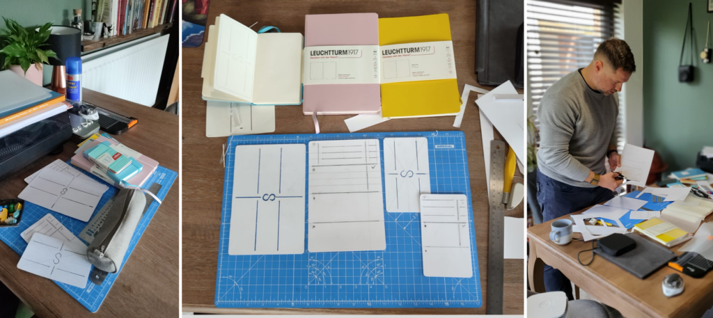
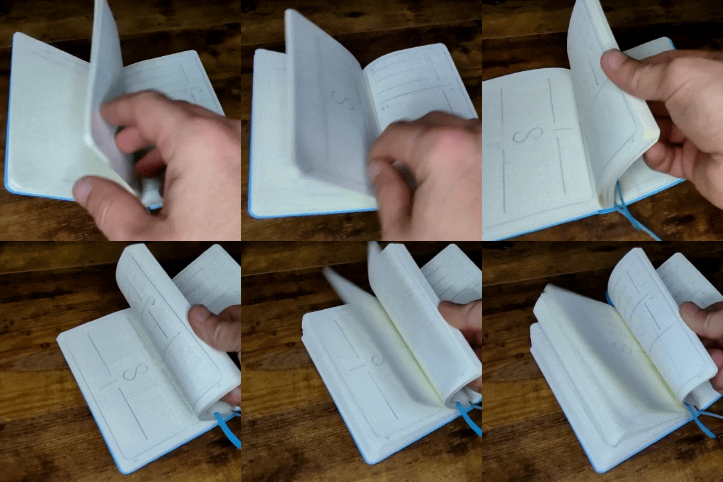
For the approaching pilot test, I developed a manual production template in collaboration with the Head of Operations. This involved creating a physical stencil and hand-drawing several complete versions of the journal. This approach allowed us to:
- Rapidly produce testable prototypes at the pilot
- Maintain consistency across multiple journal copies
- Adapt quickly to any last-minute design changes
- Meet the tight timeline for the pilot retreat
The manual production method, while labor-intensive, proved invaluable in allowing us to test our product with real users in a retreat setting, despite the constraints of our pre-seed startup environment.
2. Digital Application Concept
Alongside the physical journal, I developed a high-fidelity proof of concept for a digital application. This conceptual design was presented in a video format, with the first three minutes showcasing the app’s core functionality. The digital application was designed to:
- Complement the physical journal experience
- Provide additional features leveraging digital capabilities
- Offer a scalable solution for future market expansion
The application walkthrough video served as a key feature piece of Becoming’s pitch deck to investors to showcase market scalability and product pipeline, and to promote investment in the future of the company.
Results & Key Takeaways
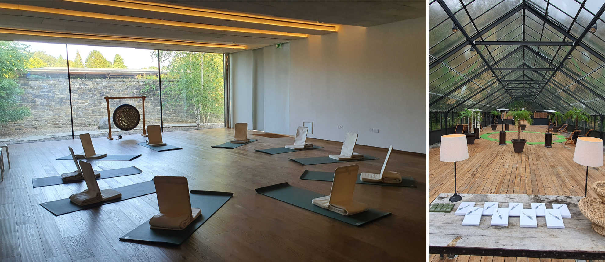
The project culminated in the successful production and deployment of the physical journal, which was effectively used at two retreats: Quinta da Bella Vista in Sintra, Portugal, and Broughton Sanctuary in Yorkshire, UK. This real-world testing provided invaluable user feedback, validating our design decisions and enhancing user engagement with journaling activities.
While the digital application concept was put on hiatus to prioritise the physical product, its high-fidelity prototype served as a crucial component of our investor pitch deck, showcasing the potential for scalability and future market growth. This strategic pivot allowed us to focus our limited resources effectively while maintaining a vision for future digital expansion.
Key takeaways from this experience include the importance of flexibility in product development, the value of real-world testing to inform design, and the benefits of a user-centric approach. The positive reception of the printed journal has established a strong foundation for future growth and potential digital offerings in our innovative journaling system.
If you’d like to learn more about Becoming’s holistic performance and wellbeing concierge services, you can find out more here: https://www.startbecoming.co/
- Product & UI/UX Designer Sketch, Figma, Photoshop, InShot, Print
- Rapid Prototyping User flows, Wireframes, High-fidelity Prototypes
- Visual Design Style guides, Branding, Marketing Materials, Graphical Assets
- Date 19 June 2023

